
Logo Idea - Part 2
- Mar 21, 2017
- 1 min read
For my 3rd idea for a logo I was playing around in Adobe Photoshop with the text tool and with the 3D effects you can create with the text tool. I feel this logo is too bold and too over the top for the design of my website itself.
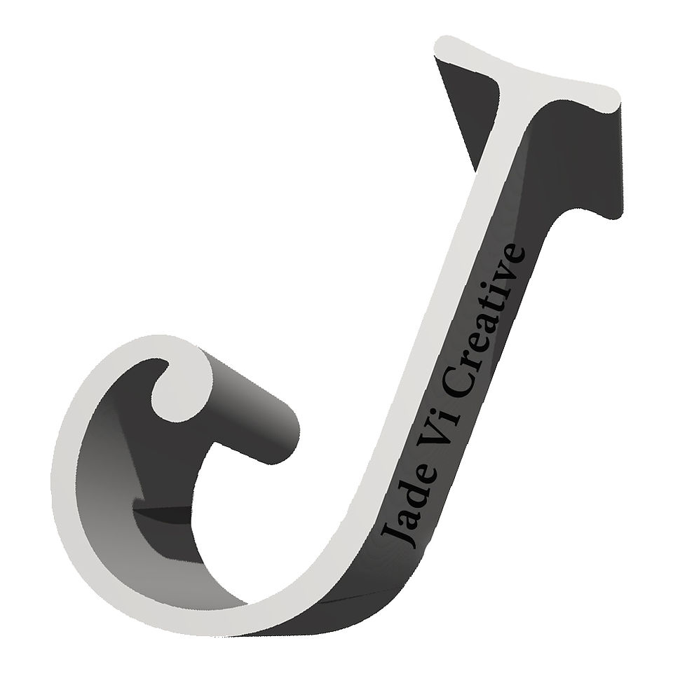
The choice of colour is too dark and over powering to the rest of the website. Also the black text going up the side of the big J is not really visible unless you are looking at the logo in a bigger size format that would be suitable for my website or in any other product.
When designing this logo I decided to have the J at an angle to give it a more visually pleasing look but I feel this is too much of an angle and that it looks too staged and too far over to create a nice logo idea.
Comments